
Leaving your Mark
or without a trace

Completely unrelated to anything sidebar:
“JMAWWorks” as a brand has been around a long time at this point, especially for a guy that doesn’t make much, and sells significantly less.
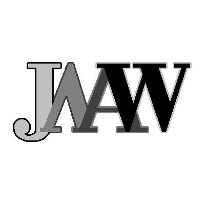
This initial logo design was created c.1996 as a profile pic (as we would call it today). It was initially made as a tiny bitmap made for HP-Ux (HP Vue). I needed this for a program my cousin & I built to allow us to instant message (+ images & sound) each other from across our work cubicle (~8ft). If only we had seen the potential beyond quietly making snide comments about our coworkers and had marketed it for messaging, we’d probably be billionaires.
You may or may not know that it’s my four initials all nestled together. It’s unchanged other than improved resolution, and outlining so that it’s readable regardless of background color. At times, I’ve considered a change to this logo, since it is multi-color gradient and doesn’t yield a nice single color logo for a maker’s stamp. This indecision is why I don’t have a makers stamp to this day.*
It’s also not even vector based; it started life as simple “JMAW” Times New Roman font text “screenshotted” in XV before that term existed. Back then, this was my font de jour, reflecting my business professional-serious side. Nothing says uptight upstart like serifs. I shudder to think what direction my life would have taken had I chosen comic sans in that moment. It was then pixel tweaked by hand in whatever limited ability I possess along the artistic spectrum.

“Works” was added c.2002 when, after discovering infill planes and seeing fellow young whippersnappers like Konrad Sauer making them and decided I too was definitely going to make the infill planes (coming soon!, surely). I’d also newly discovered and read blood and gore page cover-to-cover learning about the history of The Stanley Works and I thought that was pretty neat. So neat, in fact, that I would go on to special order from Lowe’s, a brand new #5 Stanley (c.2002, complete garbage btw)
From there, I created the blog and social media empire associated with this moniker, and the great multinational brand that is JMAWWorks was born, or so the history books may Wright someday.
*p.s. In writing this bit I decided to give Ai a chance to give me a single color variation of this simple logo, expecting to get maybe something to think or write about, but honestly it’s suggestions regardless of prompts were complete rubbish, I’m really continually surprised by the simultaneously, powerful yet also incapable nature of this new tool at times.
Oy vey! Not sure I would’ve given your profile the time of day had you chosen the path of Comic Sans 😬 those Serifs + hand tweaked pixel letters are definitely more fitting for someone on the professional-emotional artistic spectrum, such as yourself ;)